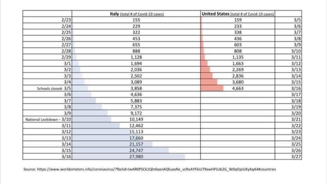
A viral graphic that has been popping up daily since the coronavirus started spreading in the United States makes it seem like the U.S. is following Italy's path.
It seems simple enough and shows the number of daily cases in the United States compared to the cases in Italy.
But there's some important context that needs to be considered when looking at the graph.


THE QUESTION:
Is a graphic on COVID-19 cases accurate in showing that U.S. cases are following the pattern of those in hard-hit Italy?
THE ANSWER:
No.
WHAT WE FOUND:
Dr. Lucina Suarez, an epidemiologist in Austin, Texas, explained that while the graphic is intended to compare the exponential growth in cases between the U.S. and Italy, it doesn’t really work. For one thing, the graphic doesn’t take into account the incidence rate – that is, factoring in the population sizes of Italy (62 million) and the U.S. (330 million).
"These comparisons are always problematic since they are based on counts and not incidence rates," she said. “While giving a sense of rapid rise in cases, it would be more valid if based on the same case definition -- for example, mild versus severe cases -- and knowing the criteria of who is tested and who is not."
She also said that the graphic doesn't factor in the testing taking place in each country. The U.S. numbers are probably under-counted currently because testing is not very available here, she said.
RELATED: VERIFY: You can still get COVID-19 if you have the flu. Everyone needs to take the same precautions.
The number of cases do match what the World Health Organization shows on its website, but it's worth noting that the WHO reports the confirmed numbers from the day before. The number of cases in the U.S. are hard to pin down by a daily count. The U.S. Centers for Disease Control and Prevention provides a daily update, but has no breakdown by day. Johns Hopkins keeps a running tally but also does not show a daily breakdown.
Other problems with the graphic: It doesn’t say expressly what the numbers represent nor does it provide an explanation of what the graphic is intended to show.
Something you’d like VERIFIED? Click here to submit your story

